| About |
| Why? |
| Screenshots |
| Download |
Screenshots
Perfect example of Colour/Style-formatting, it also show some new buttons on the interface, and the new searchbar.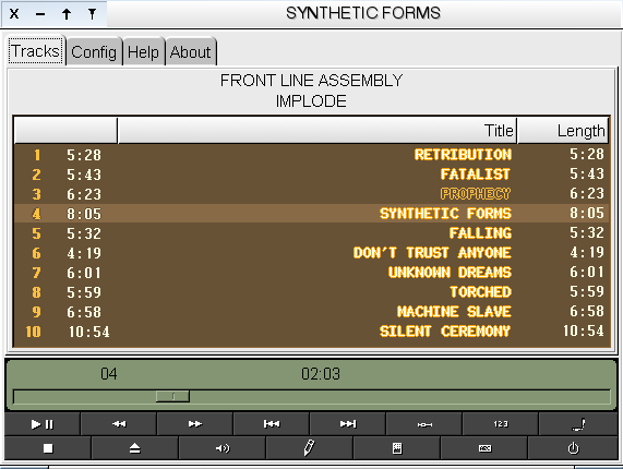
Colour/Style-formatting and the Custom-Column, also displays toggling off the column-headers.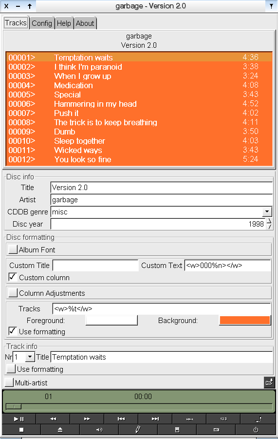
The new Colour/Style-formatting in (ugly) action.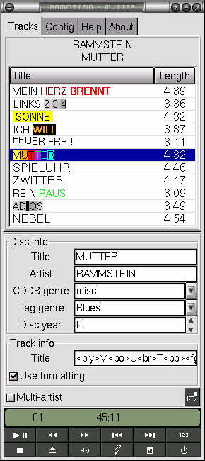
Here's how GryPhon looks by default.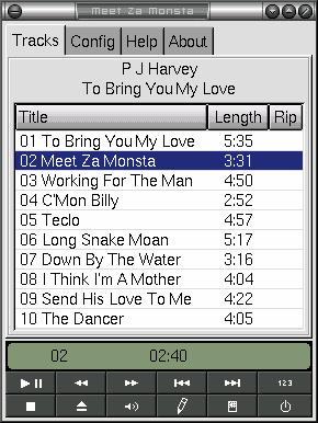
With playlist shadding/dimming on.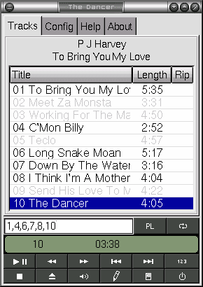
The CDDB-edit dialog.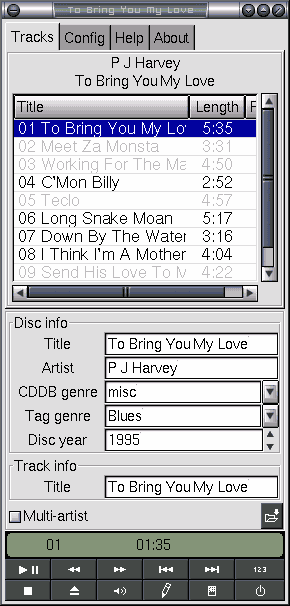
The CD-Config page.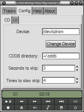
The General-UI-Config page.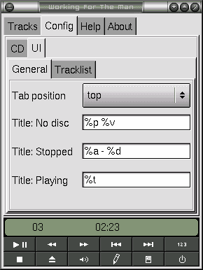
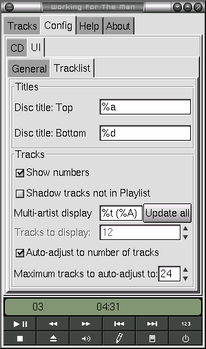
The Tracklist-UI-Config page.